A decorative accent is any non-functional object placed in a room to enhance its aesthetic, express personal style, and add emotional depth. Think vases, sculptures, textiles, artwork, and natural elements like raw stones or driftwood. These pieces don’t store, seat, or illuminate. What they do is guide the eye, create visual rhythm, and make a space feel fully designed rather than simply furnished.
The distinction between home decor and home accents is worth knowing. Home decor covers the foundational, larger items that define a room, such as furniture, lighting, and rugs. Home accents are the secondary finishing touches chosen primarily for personality and mood. They’re the layer you add after the furniture is placed, and often the layer that makes the biggest visual difference.
Used well, decorative accents do several things at once:
- Add texture and contrast without cluttering the space
- Introduce layered color through form rather than paint
- Create focal points that draw and hold attention
- Reinforce a room’s mood and design concept
- Raise the perceived value of a space through intentional curation
The key word is intentional. A single well-chosen sculpture on a console does more for a room than a shelf crowded with mismatched objects.
What types of decorative accents are there?
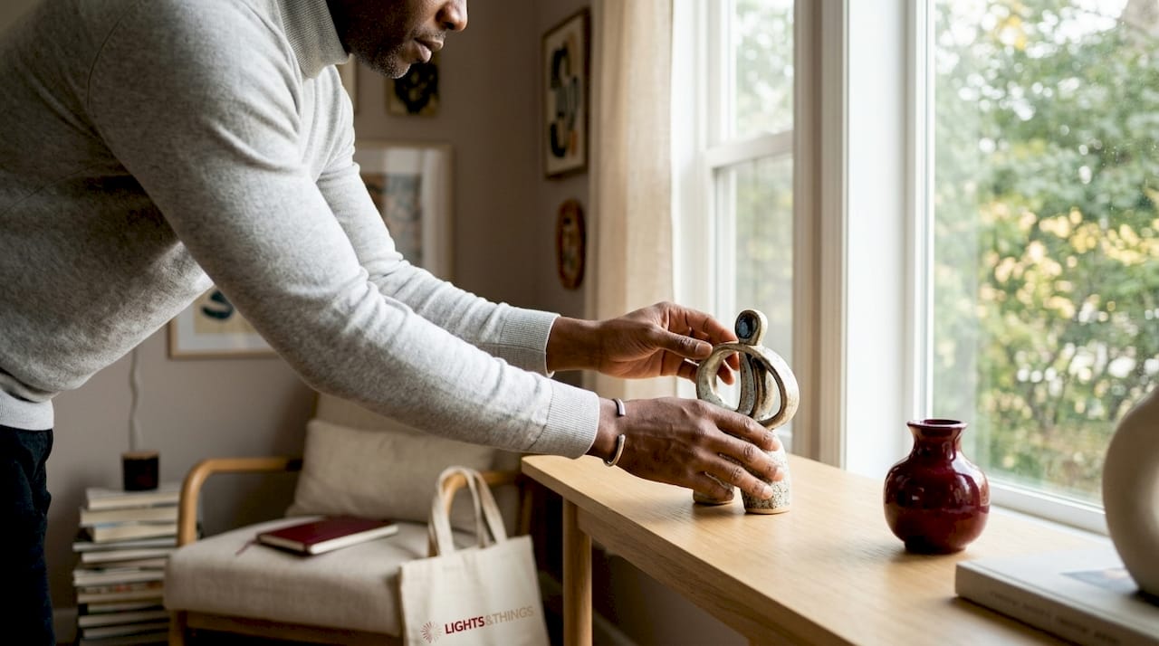
Decorative accents span a wide range of forms, materials, and scales. Understanding the categories helps you shop and style with more confidence.
By form:
- Geometric shapes: Spheres, cubes, arches, and pyramids in wood, stone, or resin. They bring mathematical calm and structure to a composition.
- Knots: Ceramic, wood, or stone knot forms suggest tension and unity. Unlike soft fabric knots, hard-material versions feel grounded and sculptural.
- Busts and figurative pieces: From abstract plaster faces to genderless clay forms, these bring a human dimension to interiors.
- Animal-inspired accents: Birds, horses, and foxes connect a room to nature and archetype without feeling literal.
- Bookends: The best ones are objects first, supports second. Marble slabs, concrete curves, or paired spheres all qualify.
- Natural elements: Driftwood, raw stones, mineral clusters, and carved pebbles bring tactile richness to smooth, controlled spaces. Curating these well, the way a high-end mineral collection is assembled, means choosing pieces with genuine visual weight rather than filling space.
- Vessels and vases: Ceramic, glass, metal, and stone versions range from tabletop scale to large floor statements.
- Textiles: Throw pillows, blankets, and woven pieces add softness and color in a way hard objects cannot.
Different forms convey different moods. Geometric accents feel calm and ordered. Figurative pieces feel personal and expressive. Natural elements feel grounded and organic. Mixing categories within a room creates the layered, collected quality that distinguishes a well-styled space from a showroom.
Design rules that make decorative accents actually work
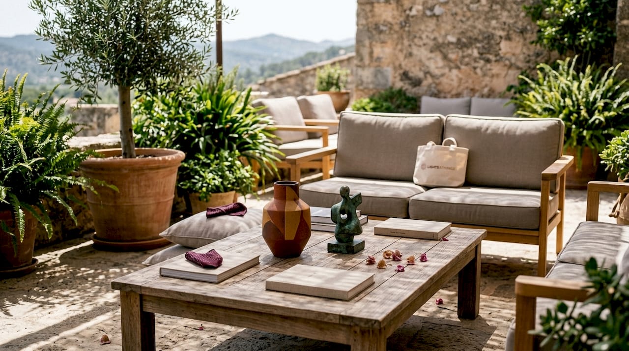
The 3-5-7 rule is the most practical principle in accent styling. It advises grouping objects in odd numbers, specifically threes, fives, or sevens, because odd groupings create dynamic, visually engaging compositions. Even numbers tend to feel static and overly symmetrical. This isn’t arbitrary taste; it reflects how the eye moves through a composition, staying engaged rather than settling into a fixed point.
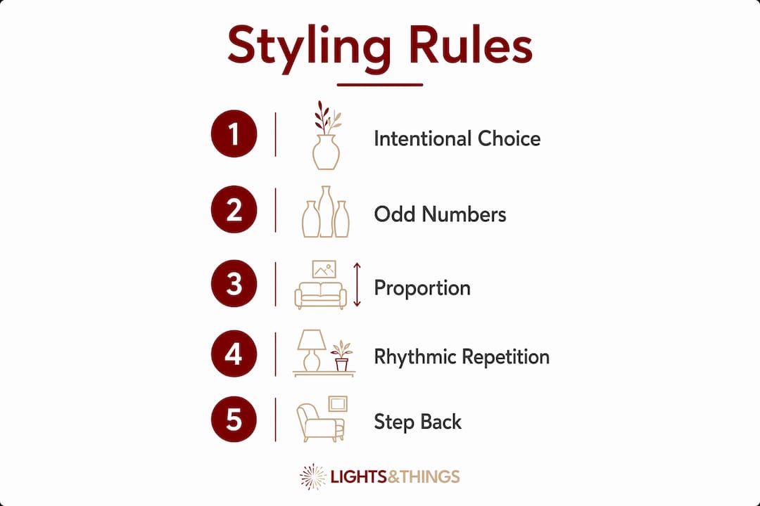
Beyond grouping, scale and proportion matter enormously. An accent that’s too small for its surface disappears. One that’s too large overwhelms the furniture around it. Always consider the piece in relation to the room, not just the shelf.
Core principles to follow:
- Vary height within groupings: tall, medium, and low pieces together create depth
- Allow breathing space around each object so it reads clearly
- Repeat a color, texture, or shape in at least two or three spots to create cohesion
- Anchor small groupings with a tray, a stack of books, or a block to give them visual weight
- Edit regularly. Overdecorating with too many small items creates clutter, while one strong accent often delivers more impact than five weaker ones
Pro Tip: Step back and look at the full room after placing accents. If your eye stops and gets stuck somewhere, that grouping needs editing. The goal is a gaze that moves through the space, not one that gets trapped.
Rhythmic repetition deserves its own mention. Repeating a specific color, texture, or shape in several spots throughout a room creates cohesion and narrative without requiring every item to match. A matte black ceramic on the coffee table, a blackened metal bookend on the shelf, and a dark stone on the console: three different objects, one visual thread.
What materials and textures work best in accent decor?
Material choice shapes the emotional quality of a room as much as color does. Common accent materials each carry a distinct feel:
- Matte ceramic: Pure, quiet, meditative. Works in almost any style.
- Glazed ceramic: Reflective and slightly formal, with occasional nostalgic warmth.
- Raw or stained wood: Organic, grounding, and warm. Pairs well with stone and linen.
- Stone (marble, travertine, granite): Weighty and architectural. Even a small marble object reads as considered.
- Metal (brushed or blackened): Industrial and modern. Blackened finishes in particular add drama without color.
- Resin: Sculptural and expressive. Allows bold forms that other materials can’t achieve.
Mixing textures such as linen, velvet, stone, wood, and ceramic adds sophisticated tactile richness that elevates neutral interiors beyond simple color schemes. A room with only smooth surfaces feels flat. Introduce one rough-textured stone piece and the whole composition gains dimension.
Neutral and tonal palettes tend to carry more impact than bright colors in accent work, especially in rooms where subtlety is the goal. Let form and shadow do the talking. Color should support the composition, not compete with it. This principle connects directly to interior styles: Japandi spaces favor ceramic knots and stone plinths; minimalist rooms call for monochrome spheres and unglazed vessels; organic modern interiors welcome raw stones and asymmetrical shapes; Scandinavian design leans toward soft forms in pale tones.
How to place and style accents in each room
Placement is as important as selection. Even a beautiful piece fails if it’s poorly positioned. The most productive surfaces in any home are coffee tables, shelving systems, sideboards and consoles, entryways, hallway niches, and window ledges.
Room-by-room guidance:
- Living room: Group accents on the coffee table using a tray to anchor the composition. Combine a sculptural object, a small stack of books, and a natural element like a stone or branch. Soften the space with textiles on seating. For sculptural accent ideas by room, a curated reference helps narrow the options.
- Entryway: One strong sculptural piece on a console makes a better first impression than a cluster of small items. The entry sets the tone for the whole home, so treat it as a single, deliberate moment.
- Bedroom: Keep nightstands calm. One or two objects maximum: a small ceramic, a candle, a single stem in a narrow vase. Clutter here disrupts the restful quality the room needs.
- Shelving: Use the 3-5-7 grouping rule. Mix books, objects, and negative space. Not every shelf needs to be filled.
- Window ledges: Translucent or light-catching objects work especially well here, glass vessels, pale stone, or mineral clusters that interact with natural light.
Seasonal rotation is one of the most underused styling tools available. Designers suggest using lighter ceramics and pale wood in spring, stone and bronze in autumn, and soft matte tones in winter. Swapping just three or four accents changes the emotional temperature of a room without touching the furniture.
Pro Tip: Use a decorative tray on your coffee table or console to group small accents. It creates a contained composition that reads as intentional, and it makes seasonal swaps much easier.
What design professionals say about using accents well
Professional interior designers treat decorative accents as visual punctuation, not afterthoughts. The difference between a room that feels dated and one that feels sophisticated usually comes down to curation: regular editing removes unnecessary items and builds the authenticity and balance that makes a space feel genuinely considered.
The most effective approach is to integrate accents early in the design process, not at the end. When you know what sculptural forms and material palette you’re working with from the start, every accent reinforces the room’s concept rather than competing with it. A calm interior built around soft ceramics and natural materials tells a coherent story. A room where accents were chosen last, from whatever was available, rarely does.
Tactile layering is what separates a luxury feel from a merely furnished one. When you combine a matte ceramic vessel, a raw wood form, and a piece of brushed metal in one grouping, the eye reads depth and intention. None of those pieces needs to be expensive. The combination does the work. For guidance on choosing sculptures for living rooms specifically, the selection process matters as much as the piece itself.
The final professional habit worth adopting: never stop editing. A room that looked right two years ago may now feel crowded or dated simply because accents accumulated without intention. Pull pieces out, live with the space, and only return what genuinely earns its place.
Key Takeaways
Decorative accents work best when chosen with intention, placed with proportion in mind, and edited regularly to keep the room feeling current and cohesive.
| Point | Details |
|---|---|
| Definition and purpose | Decorative accents are non-functional objects that add texture, personality, and visual rhythm to a room. |
| The 3-5-7 rule | Group accents in odd numbers (3, 5, or 7) to create dynamic, engaging compositions that avoid static symmetry. |
| Material and texture | Mixing materials like matte ceramic, raw wood, stone, and metal adds tactile depth that color alone cannot achieve. |
| Placement and editing | Common placement zones include coffee tables, shelves, and consoles; regular editing prevents clutter and keeps the room feeling intentional. |
| LightsThings | LightsThings offers sculptural accents and decorative lighting curated to help homeowners style rooms with both visual impact and cohesion. |
Where to find decorative accents that actually elevate a room
Most homeowners know what they want their room to feel like. Finding pieces that deliver that feeling without overcomplicating the space is the harder part. LightsThings was built for exactly that. The catalog spans sculptural objects, statement lighting, and curated decor accents, from accessible everyday pieces to premium works priced well above $1,000, all chosen with the same design principles covered in this article.
What sets LightsThings apart is the combination: decorative lighting and complementary accents in one place, so you’re not piecing together a room from five different sources. Whether you’re looking for a bold sculptural statement for a living room console or a striking pop art accent to anchor a neutral space, the selection is built around visual impact and proportion. Free shipping thresholds, easy returns, and financing options make it practical to invest in pieces that genuinely work. Browse the full collection at LightsThings and start with one strong piece.