CRI stands for Color Rendering Index, a numeric measure of how accurately a light source reveals the true colors of objects compared to a reference light of the same color temperature. The scale runs from 0 to 100, where 100 means colors appear exactly as they would under that reference source. Use CRI as a starting point when comparing bulbs, but pair it with correlated color temperature (CCT) and check the R9 value or spectral data whenever accurate reds and saturated colors matter to you.
TL;DR:
- CRI scores alone can be misleading since two bulbs with an identical score may render reds and saturated colors differently; check the R9 value for better accuracy.
- Spectral shape and a continuous spectrum produce more faithful color rendering, but LED spectra often have gaps, which can impair color fidelity despite high CRI.
- A CRI around 80 is suitable for general spaces, but for tasks involving skin tones, food, or art, a CRI of 90+ with a high R9 is strongly recommended.
- The CRI measurement uses a flawed averaging method that can hide poor performance in specific colors, especially red, which is why supplementary data like spectral distribution or TM-30 metrics are important.
- Combining CRI with correct CCT and sufficient lumens ensures proper room appearance, and for color-critical setups, ask manufacturers for R9 and spectral details before purchase.
Table of Contents
- What CRI Actually Means: The CIE Definition
- How CRI Is Measured: From Test Samples to the Final Number
- What a CRI Score Actually Tells You: 80 vs. 90 vs. 100
- Where CRI Falls Short (and What Replaces It)
- Choosing Lighting With CRI, CCT, and Lumens Together
- How LightsThings Handles CRI on Product Listings
- A Lighting Buyer’s Bottom Line on CRI
- Key Standards Worth Bookmarking
- Sources
- FAQ
What CRI Actually Means: The CIE Definition
The Commission Internationale de l’Eclairage, the international authority that governs how we measure light and color, defines color rendering as the effect an illuminant has on how object colors appear, judged against how those same colors would look under a reference light of matching color temperature. That’s a mouthful, but the concept is straightforward once you separate two things people constantly confuse.
CCT tells you whether a bulb looks warm and amber or cool and blue. CRI tells you something completely different: whether the colors of objects under that light look accurate. A bulb can have a beautiful, warm 2700K glow and still render tomatoes an odd, flattened red if its spectral output is thin in the wrong places. That’s why understanding CRI matters even after you’ve picked a color temperature you like.
Spectrum shape is the real driver here. Incandescent and halogen bulbs produce a smooth, continuous spectrum, similar to a blackbody radiator, which is part of why older lamp technology consistently scores near the top of the scale. Our LED vs incandescent comparison covers this trade-off in more depth. LEDs, by contrast, often generate light through a blue diode paired with a phosphor coating, which produces a spikier spectrum with gaps and peaks. Those gaps are exactly where color fidelity problems tend to hide.
A few things worth locking in before you go further:
- CRI measures fidelity to a reference, not whether you like how a light looks.
- CCT and CRI are independent measurements; a bulb needs both specs to be evaluated fairly.
- A continuous spectrum generally renders color more faithfully than a spiky one, even at the same CCT.
How CRI Is Measured: From Test Samples to the Final Number
The CIE 13.3 methodology is the standard that defines how a CRI number gets calculated, and the process is more involved than most spec sheets let on.
Step one: pick the reference. For light sources under roughly 5000K, the reference is a Planckian blackbody radiator at the same color temperature. For light sources above that threshold, the reference switches to a standard CIE daylight illuminant. This matters because the test light is only ever compared to a reference that matches its own color temperature. A 3000K LED is judged against a 3000K blackbody, never against daylight.
Step two: apply the test color samples. The original CRI method uses eight moderately saturated color samples pulled from the Munsell color system, covering a range of hues at medium saturation. These eight generate the Ra score you see on packaging. A separate set of additional samples, including a highly saturated red known as R9, generates individual special indices called Ri. R9 is not part of the standard Ra average, which is one of the most consequential quirks of the entire system.
Step three: run the math.
- Illuminate each test sample under both the test light and the reference light.
- Apply a chromatic adaptation transform, typically a Von Kries correction, so the comparison accounts for how the eye adjusts to different light colors.
- Calculate the color difference, ΔE, between the sample’s appearance under the test light and under the reference, using a uniform color space.
- Convert that difference into a special index using the formula Ri = 100 − 4.6 × ΔEi.
- Average the first eight Ri values to get Ra, the number commonly reported as CRI.
That chromatic adaptation step is easy to skim past, but it’s central to why small spectral differences can produce outsized perceptual effects, since the CIE 13.3 standard builds the entire index around correcting for how the eye recalibrates to a light source before measuring color error.
Pro Tip: If a manufacturer only lists a single CRI number with no supporting data, ask for the spectral power distribution (SPD) chart or the individual R9 value. A high Ra with a low R9 is a common way for a bulb to look great on paper and disappointing on your kitchen counter.
What a CRI Score Actually Tells You: 80 vs. 90 vs. 100
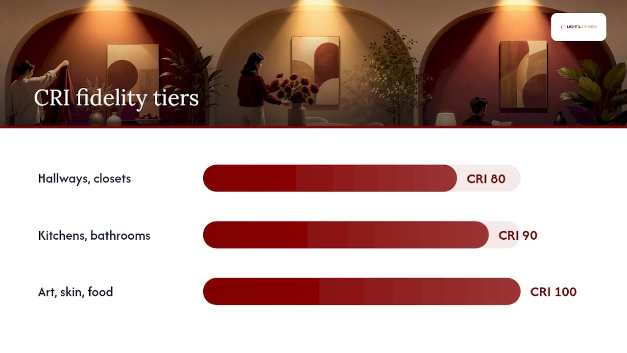
A CRI around the low eighties is generally accepted for most general-purpose lighting, suitable for hallways, closets, and casual living spaces where precise color isn’t critical. For areas where accurate evaluation of skin tones, food, art, or fabric matters, a CRI in the low nineties or higher is typically recommended.
Here’s where it gets interesting: two bulbs can both score 80 CRI on the box and render red completely differently, because Ra only averages eight moderately saturated samples and R9, the saturated red sample, isn’t part of that average. A light source can post a solid Ra number while still butchering red. That’s a real problem for skin tones (which contain a surprising amount of red undertone), fresh produce, red fabric, and artwork with warm color palettes. Practitioners who care about accurate reds specifically request R9 data rather than relying on Ra alone, since the special indices in CIE 13.3 exist precisely to catch what the averaged score misses.
A quick reference for where the threshold should shift:
- A CRI around 80 is usually acceptable for hallways, bedrooms, closets, and general ambient lighting.
- A CRI of about 90 or above is recommended for kitchens, bathrooms, retail displays, and any setting where skin tone or food color matters.
- For art lighting, photography setups, and color-critical workspaces, higher CRI values combined with strong red rendering (R9) are preferred.
- A CRI of 100 represents the reference source itself, serving as a conceptual maximum rarely reached in commercial bulbs.
If you’re lighting a gallery wall, a vanity mirror, or a kitchen island where produce and finishes need to look true, don’t stop at the headline CRI number. Ask what the R9 value is before you buy.
Where CRI Falls Short (and What Replaces It)
CRI has real, well-documented limitations, and the gaps matter more with LED technology than they ever did with incandescent bulbs. NIST has been explicit that the metric was built for older lamp types with smooth, continuous spectra, and it doesn’t always predict how good an LED will look to an actual observer.
The core problems break down like this:
- Averaging hides outliers. Ra is a mean of eight Ri scores, so a light source can bomb one color and still post a respectable overall number.
- R9 isn’t included in the average, which means saturated red performance can be invisible on the spec sheet unless it’s listed separately.
- The method predates LED spectra. It was developed for lamps with continuous emission curves, and spiky LED output doesn’t always behave the way the original math assumed.
- It measures fidelity, not preference. A high-CRI light can still look flat or unappealing to a viewer, because accuracy and visual appeal aren’t the same thing.
That last point is worth sitting with: research into color quality consistently finds that observer preference and colorimetric fidelity diverge, which is exactly why NIST’s Color Quality Scale (CQS) was developed as a supplement rather than a replacement. CQS tries to account for how humans actually judge color quality, not just how closely colors match a mathematical reference.
The other major alternative gaining traction among lighting designers is TM-30, an IES-published method that reports two separate numbers: Rf for fidelity (similar in spirit to Ra, but built on 99 color samples instead of eight) and Rg for gamut, which tells you whether colors appear more or less saturated than the reference. TM-30 also generates a color vector graphic that shows exactly which hues shift and by how much, which is far more diagnostic than a single averaged number. If you’re speccing lighting for a professional application where color accuracy is non-negotiable, ask for TM-30 output or at minimum a full SPD chart rather than settling for Ra alone.
Choosing Lighting With CRI, CCT, and Lumens Together
CRI never works alone. It’s one leg of a three-part decision that also includes color temperature and brightness, and skipping any one of them tends to produce a room that looks technically fine on paper and wrong in person.
Here’s a practical sequence for working through a purchase:
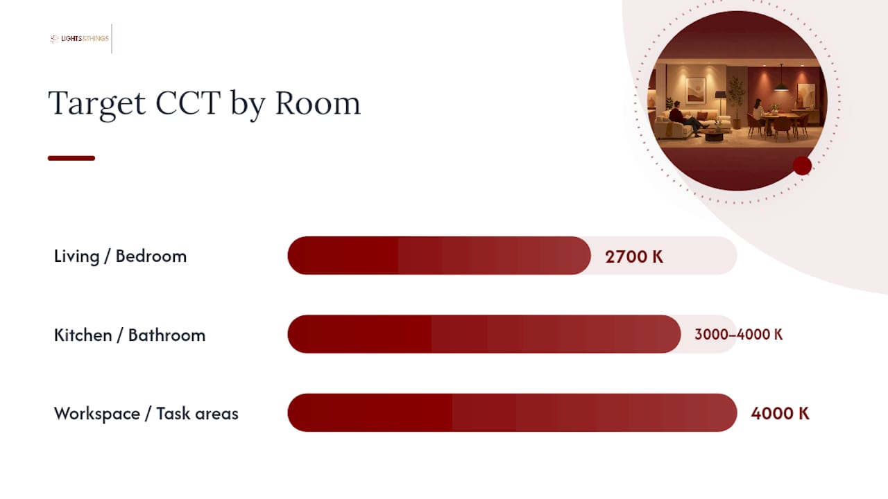
- Set your CCT target first. Warm spaces (living rooms, bedrooms) typically land around 2700K to 3000K; task-heavy spaces (kitchens, workspaces) often call for 3500K to 4000K.
- Set your CRI floor based on the room’s job. 80 for general ambient spaces, 90+ for kitchens, bathrooms, and anywhere color judgment matters.
- Check lumen output against room size and task, since even a perfectly color-accurate bulb feels wrong if it’s too dim or too harsh. Our lumens per room guide walks through that math room by room.
- Confirm dimmer compatibility if the fixture will run on a dimmer switch, since not every LED dims cleanly, and color shift under dimming is its own separate issue from CRI. This dimmable LED guide breaks down what to check before buying.
- Ask for R9 or SPD data on any purchase where color accuracy genuinely matters, rather than relying on the printed CRI number alone.
Room by room, the rules stay fairly consistent: living rooms lean warm (2700K) with CRI 80 or better; kitchens and bathrooms should target 90+ CRI at 3000K to 4000K; workspaces benefit from 4000K and 90+ CRI to reduce eye strain and keep documents readable; display or art lighting deserves the highest CRI and R9 combination you can find, since these are the applications where fidelity errors show up first.
Pro Tip: When comparing two fixtures with the same CRI number, check the lumen output and beam angle too. A high-CRI bulb throwing too little light, or spreading it unevenly, won’t solve a room that just needs more brightness. If you’re weighing ceiling fixtures specifically, our guide to choosing ceiling lighting covers how CRI factors into fixture selection for kitchens and living spaces. And if you’re the kind of shopper who plans renders or mockups before committing, the rendering settings checklist for architects offers a useful parallel: how a scene is lit under test versus reference conditions changes what colors actually look like on screen, too.
How LightsThings Handles CRI on Product Listings
Product pages should give you enough information to make this decision without a lighting degree, and that’s the standard LightsThings holds its listings to. Where a manufacturer supplies CRI and CCT figures, both appear on the product detail page so you can evaluate color fidelity and warmth together instead of guessing at one from the other.
For fixtures where color accuracy carries real weight, think statement chandeliers over a dining table, task lamps for a reading nook, or display lighting for art and collectibles, we recommend leaning toward higher CRI ratings whenever the option exists in a given style and price range. Browse the current ceiling lighting, floor lamps, and home decor collections to compare specs side by side before you commit to a fixture.
If a listing doesn’t show the detail you need, particularly R9 or spectral data for a color-critical application, reach out through customer support and ask directly. Manufacturers don’t always publish that data by default, but it’s often available on request, and it’s worth the extra step before you commit to lighting a space where color truly matters.
A Lighting Buyer’s Bottom Line on CRI
CRI measures fidelity, full stop. It doesn’t measure whether you’ll like a light, and it doesn’t automatically flag a weak red channel that a raw Ra number can quietly hide. Treat it as one input, pair it with CCT for warmth and R9 for red accuracy, and weight all three against what the room actually needs to do.
For most homeowners, the priority order is simple: get lumens and CCT right for comfort and function, hold the line at CRI 80 for everyday spaces, and push for 90 or higher wherever color judgment actually happens, kitchens, vanities, art walls, reading chairs. When you’re unsure which number matters more for a specific fixture, Product pages and support teams are built to help you sort that out before you buy.
— Norm Blain
Key Standards Worth Bookmarking
For deeper verification: CIE 13.3 covers measurement methodology, NIST’s CQS documentation covers CRI’s limitations, and IES offers practical, professional interpretation.
Sources
- Color Quality Scale (CQS) — NIST
- Color rendering index (of a light source) — IES
- Color rendering index
FAQ
What Is CRI Short For?
CRI stands for Color Rendering Index, a scale that measures how accurately a light source reveals object colors compared to a reference illuminant of the same color temperature. The scale runs from 0 to 100, with the reference light itself scoring 100.
What Is a Good CRI Rating?
A CRI of 80 or above is generally acceptable for everyday residential lighting like hallways and bedrooms. For color-critical spaces such as kitchens, bathrooms, and art displays, aim for 90 or higher, and check the R9 value separately since it’s excluded from the standard averaged score.
What Is the Purpose of CRI?
CRI exists to give buyers and lighting professionals a standardized way to compare how faithfully different light sources render color, using the CIE’s formal testing methodology. It helps you predict whether a bulb will make colors look natural or distorted before you install it.
Is 80 CRI Good Enough?
For general ambient lighting, 80 CRI is a reasonable floor and works fine in most living rooms, hallways, and closets. It’s not ideal for kitchens, bathrooms, retail displays, or anywhere you’re judging skin tone, food color, or artwork, where 90+ CRI with a strong R9 value delivers noticeably truer color.